There are many ways Fake News creates fear, and here’s one recent example of the New York Times doing just that.
In the Infographic below, you will see a NY Times “story” about Texas COVID death rates.
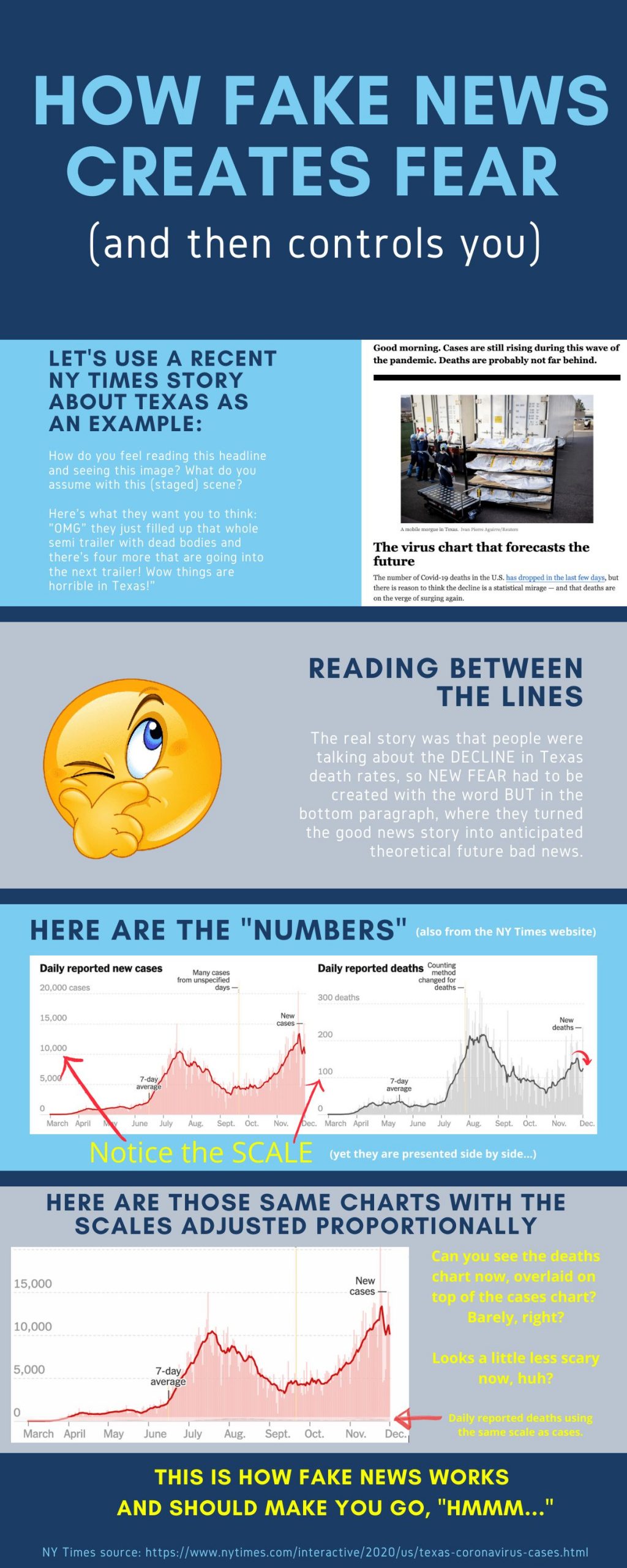
They felt compelled to publish it because the death rates were going down in late November 2020, and people were talking about it, which damages their fear agenda.
So to get the fear back up to where they want it, they staged a photo, making it look like trucks were filling up with dead bodies, and wrote about how the death rates will come back up soon.
The truth is, however, that the biggest death number day in the worst COVID county (Harris County) was four people. Hardly enough to fill up a semi-truck trailer, as the staged photo depicts.
Seriously. Four. On the worst day in late November, over an entire county. I didn’t believe it myself, so I made a Google sheet to make sure I wasn’t seeing things.
Then I noticed the charts on the New York Times website were drawn to be skewed so the deaths and cases looked proportional. But the scales were almost 10x different…
I made the infographic below to show all this because it’s so blatant.
It’s not blatant to most people though because they aren’t researchers like I am, so most don’t understand statistics, data, graphs, scales, etc.
And the NY Times knows that, so they figure they can get away with FAKE NEWS crap like this.
Here’s the scam laid out for you, so anyone can see through their sham: